![]()
Please refer to the Settings Guide for details.
 18.15 Historical Trend Graph Settings Guide
For details about placing parts or setting addresses, shapes, or colors, please refer to the "Part Editing Procedure".
8.6.1 Editing Parts
![]()
Please refer to the Settings Guide for details.![]() 18.15 Historical Trend Graph Settings Guide
18.15 Historical Trend Graph Settings Guide
For details about placing parts or setting addresses, shapes, or colors, please refer to the "Part Editing Procedure".![]() 8.6.1 Editing Parts
8.6.1 Editing Parts
Values of two Word devices (D100/D101) are collected and points and lines are displayed in a graph as x-axis/y-axis coordinates.
You can display normalized data and compare it with actual data.
On the [Parts (P)] menu, point to [XY Scatter Graph (Y)] and select [XY Historical Scatter Graph (X)] or click ![]() to place it on the screen.
to place it on the screen.
Double-click the new Graph. The following dialog box appears.
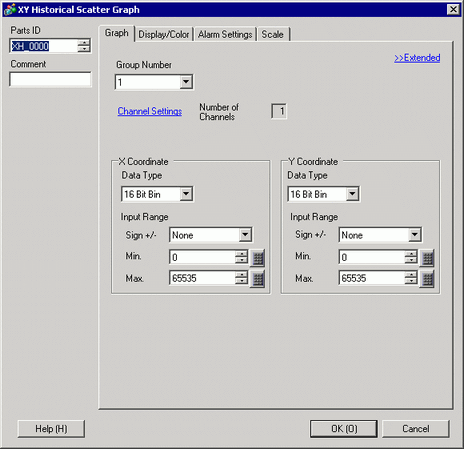
In [Group Number], select the number of the sampling group you want to display.
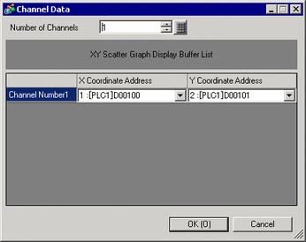
Click [Channel Settings]. The following dialog box appears.
In [Number of Channels], set the number of sets of data lines to display on the graph (1). In [Channel Number 1], select [X Coordinate Address] (for example, D100) and [Y Coordinate Address] (for example, D101).
Set the data type and input range (Min/Max) for the graph data.
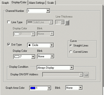
On the [Display/Color] tab, set the type and color of the line/point of the graph to be displayed and the color of the Graph Display Area. When you display the graph with only points, check [Dot Type] and clear the [Line Type] check box.
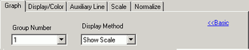
Click [Extended] in the [Graph] tab, and select [Show Scale] for [Display Method]. The [Auxiliary Line] tab and [Normalize] tab are displayed.
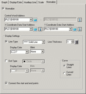
Set normalization in the [Normalize] tab.
Select the [Normalize] check box.
Set the addresses for [Control Word Address], [X Coordinate Data Start Address] and [Y Coordinate Data Start Address]. In [Display Settings], set the type, color, and so on, of the lines and points for the normalized data.
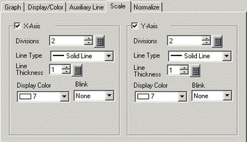
Configure x-axis and y-axis in the [Scale] tab.
Check [X-Axis] and [Y-Axis], and set the number of divisions, type, display color and blink.
Set the auxiliary line in the [Auxiliary Line] tab as necessary and click [OK].