Values of two Word devices are collected and points and lines are displayed in a graph as x-axis/y-axis coordinates.
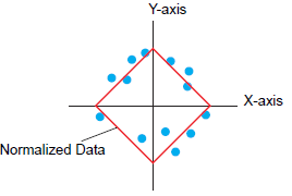
You can display normalized data and compare it with actual data.
![]()
Use the Sampling function to get data. To display a historical trend graph, you first need to set up device/PLC data to be collected in the display unit using the sampling function.![]() 24.3 Sampling Data at Constant Intervals
24.3 Sampling Data at Constant Intervals
![]() 24.4 Sampling Data at Specific Periods
24.4 Sampling Data at Specific Periods
![]()
Please refer to the following for models compatible with XY Historical Scatter Graphs.![]() 1.3 Supported Features
1.3 Supported Features
Normalized data can be set in XY Historical Scatter Graph.
XY Historical Scatter Graph shows the values of collected sampling data in x-axis/y-axis coordinates.
![]() 18.8.1 Procedure - Place Normalized Data on a Graph for Comparison with Actual Data
18.8.1 Procedure - Place Normalized Data on a Graph for Comparison with Actual Data