![]()
-
Please refer to the Settings Guide for details.
 19.15 XY Historical Scatter Graph Settings Guide
 -
For details about placing parts or setting addresses, shapes, or colors, please refer to the "Part Editing Procedure".
8.7.1 Editing Parts
![]()
Please refer to the Settings Guide for details.
![]() 19.15 XY Historical Scatter Graph Settings Guide
19.15 XY Historical Scatter Graph Settings Guide
For details about placing parts or setting addresses, shapes, or colors, please refer to the "Part Editing Procedure".
![]() 8.7.1 Editing Parts
8.7.1 Editing Parts
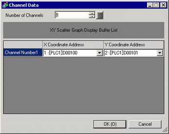
The sampled values of two word addresses (D100/D101) are displayed as one point on the graph's x/y-axis.
On the [Parts (P)] menu, point to [XY Scatter Graph (Y)] and select [XY Historical Scatter Graph (X)] or click ![]() to place it on the screen.
to place it on the screen.
Double-click the new Graph. The following dialog box appears.
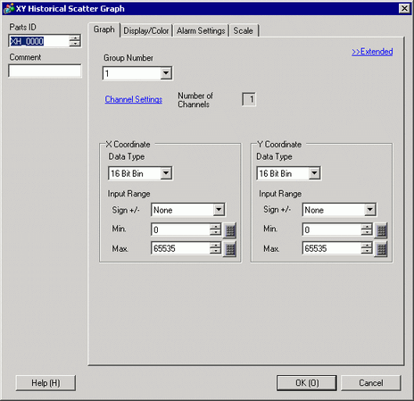
In [Group Number], select the number of the sampling group you want to display.
Click [Channel Settings]. The following dialog box appears.
In [Number of Channels], set the number of sets of data lines to display on the graph (1). In [Channel Number 1], select [X Coordinate Address] (for example, D100) and [Y Coordinate Address] (for example, D101).
Set the data type and input range (Min/Max) for the graph data.
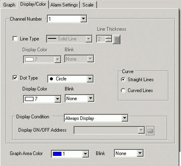
On the [Display/Color] tab, set the type and color of the line/point of the graph to be displayed and the color of the Graph Display Area. When you display the graph with only points, check [Dot Type] and clear the [Line Type] check box.
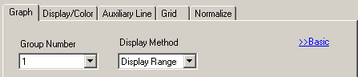
Click [Extended] in the [Graph] tab, and select [Display Range] for the [Display Method]. The [Auxiliary Line] tab and [Normalize] tab are displayed.
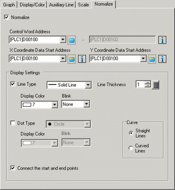
Set normalization in the [Normalize] tab.
Select the [Normalize] check box.
Set the addresses for [Control Word Address], [X Coordinate Data Start Address] and [Y Coordinate Data Start Address]. In [Display Settings], set the type, color, and so on, of the lines and points for the normalized data.
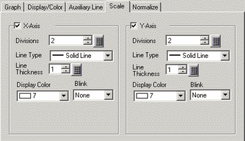
Configure x-axis and y-axis in the [Scale] tab.
Check [X-Axis] and [Y-Axis], and set the number of divisions, type, display color and blink.
Set the auxiliary line in the [Auxiliary Line] tab as necessary and click [OK].